C3: The emerging “gold standard” of customer disclosures that investors should demand
Those of you who have long been following our work on Customer-Based Corporate Valuation (CBCV) already know how important customer metric disclosures are for investors. They provide insight into critical aspects of customer behavior – acquisition, repeat purchasing, churn, spending – that are impossible to see using traditional financial metrics on their own. Two companies can have identical surface-level financials but very different underlying customer behavior, resulting in drastically different inferences of future viability. The right customer data, coupled with the right models to predict future customer behavior, can give you a big edge over investors using more traditional valuation metrics and methods.[1] More than that, the right data/models can give you diagnostic insights into the health of the customer base and the main opportunities and/or risk factors associated with an investment in a firm, such as an over-reliance on new customer acquisition, poor trends with customer retention, or declining basket size.
The CBCV frameworks that we have proposed to date for subscription and non-subscription firms have been agnostic to the input data that we have to train the models upon. This has been a deliberate objective as we have developed new statistical methods, and we’re proud that our models aren’t beholden to any particular kinds of data structures. Even if a firm discloses only a small amount of customer data, our stance has generally been that something is better than nothing – particularly if you have the model-building and computational skills to squeeze the most value out of a limited dataset.
But firms can – and should – do better than this. Investors are the owners of the companies, not the other way around. If certain data can be particularly useful for prospective and current shareholders to make informed investment decisions, they should demand it. Regulators, such as the SEC in the US, the FCA in the UK, and the BaFin in Germany, should weigh in, and if certain data are highly value relevant, then these policy makers should require (or at least strongly recommend) it to be made public. Firms themselves may have a “less is more” mentality towards financial disclosures, but on the whole, they too will benefit from higher transparency and better accountability, which should lead to higher trading liquidity and, ultimately, higher valuations. And for firms with healthy customer behavior and unit economics, disclosing the right customer metrics can be one of the easiest ways to communicate that health to existing and potential investors particularly when traditional financial metrics are unable to convey this important source of value.
Calls for more disclosure from academia are growing louder. Baruch Lev, professor of accounting at finance at NYU’s Stern School of Business, has written extensively on this subject. We have done some work studying what the most informative customer metric disclosures are from a statistical standpoint. But we would like to take this a step further and proactively recommend what we consider to be the single most important customer-related disclosure that firms can (and, we would contend, should!) report.
Introducing the Customer Cohort Chart (C3)
This disclosure is simple, but it is more than just a single number. It’s a chart that we call the “Customer Cohort Chart,” or C3 in short. It’s very straightforward – it’s just total orders,[2] period by period, broken down by customer acquisition cohort – but we will go so far as to say that no other disclosure beats it in terms of information content, pound for pound. The C3, in conjunction with a few basic customer-related metrics (for example, active customers, acquired customers, etc.) and required financial disclosures, are all that investors need to compute an accurate model for the flow of customers acquired over time, the orders they place while “alive,” the amount of spend associated with those orders, and how that spend translates into profitability. This is all we need to perform a proper CBCV analysis for a firm.
Although we’re not aware of any focused discussions on the C3, companies are already catching on and sharing this kind of data on their own. Probably without their even knowing it, many companies have stumbled their way into disclosing the C3, or close cousins of it, in their public filings.
Here are just a few examples, with more included in the index at the end of this article.
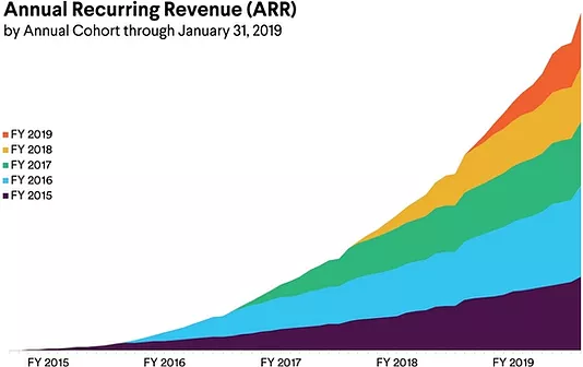
Team collaboration software tool Slack disclosed Annual Recurring Revenue by cohorts of paid customers in their pre-IPO S-1 filing (link):
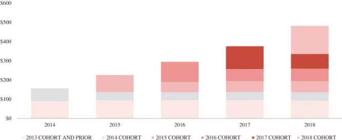
Online apparel retailer REVOLVE disclosed net sales by acquisition cohort in their pre-IPO S-1 filing (link):
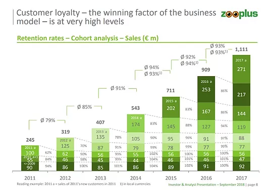
Pet supplies company Zooplus disclosed total sales by cohort in a recent analyst presentation (link):
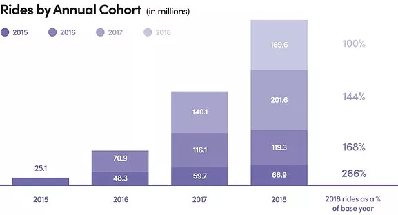
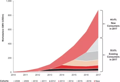
Last, but certainly not least, transportation network company Lyft disclosed marketplace gross market value by acquisition cohort in their pre-IPO S-1 filing (link):
These charts suggest positive top-line dynamics, but as always, the real question is what all of this implies for the classic CBCV
This decision appears to be in contrast to their main competitor, Uber, who decided against including the C3 in their own S-1 filing. Why Uber decided to do this we will never know, but suffice it to say that we were disappointed.
We could go on, but clearly there are many other examples where these come from.
As these disclosures imply, we are not asking for something that all companies would be reluctant to share. To the contrary – we are pleased to see how many recent IPO’s have voluntarily included C3’s in their S-1 filings. However, the fact that most of these disclosures are largely limited to firms’ pre-IPO filings also makes clear that we have a long way to go before these metrics are a part of the everyday investor lexicon. We believe the C3 should be a regular part of firms’ periodic disclosures from a broad cross-section of public companies, and the growing trend towards embracing the C3 by tech “Unicorns” within the last year indicates that many other public companies are starting to notice – and will consider doing the same.
The Virtues of Cohort-Level Data
One of the most important characteristics that the C3 and all of the above charts enjoy is that they provide data by cohort. What is it exactly that makes cohorted data so special? Let’s take a quick look at the examples above to show the sort of insights that we can glean, some of which require no more than a cursory look at the charts themselves.
Acquisition. Customer acquisitions can be assessed directly from the charts by looking at the top-most bar each period. At REVOLVE, for example, new customers brought in ~$50M in 2014, ~$100M in 2015, and so on. It is very important to know how much of a company’s business is coming in from new customers in a particular year because this information has implications regarding future reliance on new customer acquisition. REVOLVE’s chart also tells us that in 2017, it generated well over 50% net sales from existing customers, which means that a significant portion of sales are coming from people who will require less marketing spend to generate orders. As another example, Lyft’s 2017 chart data shows that the percentage of rides from existing customers appears to be much less than that of REVOLVE. This implies that as Lyft matures, it will have more opportunity for margin expansion as a larger proportion of its ride revenue will come from existing customers. All of this is critical information for investors.
Churn. To get a sense for a company’s churn profile, investors can look at each cohort’s sales over time. Zooplus is a good example of this. Its revenue retention rate for the 2011 cohort was 62% in year 1, 90% in year 2, and around 100% in year 3 and beyond. It is encouraging that after the year 1 drop, retention becomes quite stable over time. Revenues from a particular cohort at Zooplus will probably be akin to an annuity equal to sales in that cohort’s third year.
Another observation we can infer from this chart is that Zooplus’s year 1 retention has been consistently improving – from 62% for the 2011 cohort up to 86% for the 2016 cohort – which is a positive sign.[3]
At all four firms we provided charts for, we see similar signs of strong repeat business, most notably at Slack. This is probably why these firms are disclosing these cohorted charts in the first place. But this information is just as valuable, if not more so, for investors in companies that don’t have such strong repeat buying patterns.
Heterogeneity. Those first two areas of insight are clearly valuable, but they also pop right off of the chart. A third type of insight, which is much more subtle, is the nature/degree of customer heterogeneity in the customer base – how different customers are from one another. This is important for two reasons:
- First, firms with a high degree of customer heterogeneity have more opportunities to create value through customer-centric initiatives, building their businesses around the needs of the most valuable customers. This is because the best customers at firms with high heterogeneity are, by construction, that much better than all other customers.[4]
- Second, companies with more heterogenous customer bases are more likely to be undervalued by those using more traditional approaches. A previous note we wrote highlights how summarizing the retention of a customer base with a single churn rate can undervalue a company by 50% or more. It can be shown that the undervaluation moves in lockstep with heterogeneity – the more heterogeneity there is in the customer base, the stronger the undervaluation is when using a single average churn rate.
It may be hard for most investors to quantify and measure customer heterogeneity using these charts, but CBCV gives them the tools to do it. For example, REVOLVE’s chart show that after the initial drop in sales after the first year, they remain relatively stable in the following years, which is a strong indication of high customer churn heterogeneity. For a more in depth look at an example of this trend, check out our pre-IPO analysis of Farfetch.[5]
The Time is Now to Start Disclosing the C3
In closing, the C3, in conjunction with required financial disclosures, conveys to investors a full customer-based summary of a firm – customer acquisition, retention, heterogeneity, basket size, and how these factors have been evolving over time. Some companies are starting to disclose similar data, but as we have seen above, it’s only a select set of firms for whom these charts paint the firms in a good light, and it’s usually only before their IPO’s that they disclose it. It’s high time for investors to demand customer-related disclosures from more firms on a more regular basis.
What’s your C3? You should know what it looks like and what it means – and you should start to expect your investors and other stakeholders to demand it from you.
Appendix
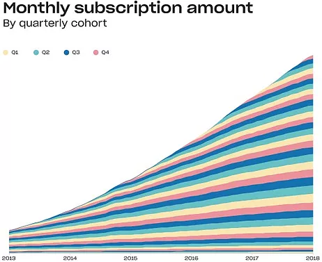
File hosting service Dropbox included monthly subscriptions by quarterly cohort in their S-1 filing last year (link):
Online luxury marketplace Farfetch disclosed marketplace gross market value by acquisition cohort in their pre-IPO F-1 filing (link):
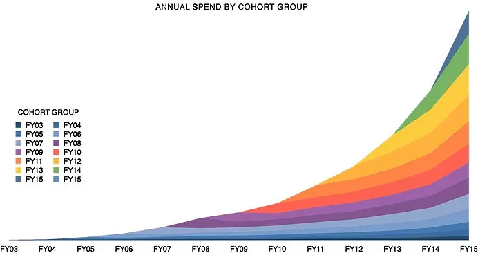
Enterprise software company Atlassian disclosed their annual net sales by cohort in their pre-IPO S-1 filing (link):
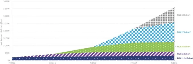
Zooplus competitor Chewy.com disclosed their annual net sales by cohort in their pre-IPO S-1 filing, alongside a few other cohort focused charts (link):
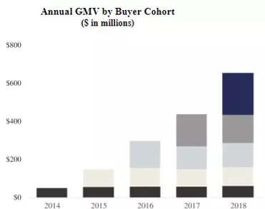
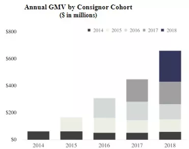
Most recently, luxury marketplace The RealReal disclosed their GMV by acquisition cohort not only for their buyers, but also for their sellers (link):
In addition to the above data that we used to train our model, there was one “holdout” data point that Lyft had disclosed which we did not use for modeling – so we can use it as another form of model validation: the company said that it reached one million total rides some time in 2013. According to our model, they hit one million rides in May 2013. While one year is a fairly wide range, it suggests that our model is capturing different aspects of Lyft customers’ behavior quite well – giving us confidence to project beyond the available data to make the forecasts necessary for a proper assessment of the firm’s future profitability.
Footnotes:
[1] For more information on how this is done, take a look at the growing number of real-world examples that we’ve made publicly available, including Farfetch, Blue Apron, HelloFresh, Wayfair, Overstock, DISH Network, and Sirius XM.
[2] Charts showing cohorted sales (or a proxy thereof) would simply need to replace sales with orders. Don’t get us wrong: cohorted sales is highly informative. Still, the reason we advocate disclosing orders and not sales by cohort in the C3 is that firms are already required to disclose total sales – but not total orders – in their financial statements. Having this additional information about orders allows us to tease apart whether revenue growth is coming from changes in orders or from changes in sales per order, a very relevant distinction for investors. In addition, the C3 would be even more informative if firms were to disclose data quarter by quarter (or better yet, month by month) instead of year by year.
[3] The only issue with this chart is that it shows revenue retention, not customer retention. This conflates two different processes – customer churn and revenue expansion while customers are alive. This wouldn’t make a difference to investors who are only concerned with modeling revenues and understanding how much revenue a particular cohort will generate after it has been acquired, but does have implications for the risks that investors are taking on when they make an investment in the firm.
[4] For more on the magnitude of customer heterogeneity across a wide cross-section of publicly traded firms, and how it varies as a function of the characteristics of those firms, read this paper we wrote with NYU marketing professor Russ Winer on the topic. Also see this new book for discussions about how best to leverage heterogeneity.
[5] To gather all information contained in these charts, we would recommend using pixel tracking software to convert the chart into a table representing total orders by acquisition cohort.